
Schools & Districts / Case study
From WY-TOPP Results to a Plan: A District Reporting Case Study
How a school district I worked with turned its WY-TOPP results into reports its PLC teams could use, and into a plan for specific targets in 2026-27.
The problem: good data that is hard to use
Every spring, Wyoming students in grades 3 to 10 take the WY-TOPP, the Wyoming Test of Proficiency and Progress. The results show which students are Below Basic, Basic, Proficient or Advanced, and they shape school and district goals for the year ahead.
Results often arrive as dense spreadsheets and state-format files. Principals and teachers get them, with little time to sort, filter and work out what the numbers mean for their own students. The data is there. The story often isn't.
The project: the same students, a year apart
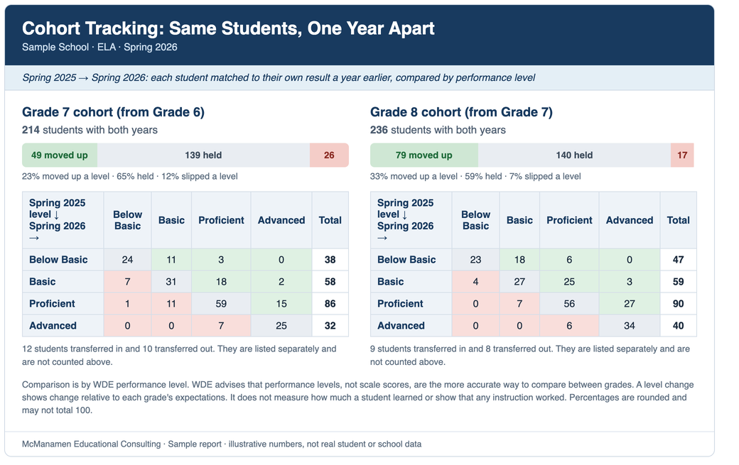
In spring 2026 I worked with a school district to build WY-TOPP reports for its schools. The first question was simple: how did our students move? Most reports compare this year's seventh graders with last year's seventh graders, who are a different group of kids. So I matched each student's Spring 2025 result with the same student's Spring 2026 result. Grade 6 students became the Grade 7 cohort, and Grade 7 students became the Grade 8 cohort.
WDE notes that WY-TOPP cut scores are not on a common scale from grade to grade, and says performance levels are the more accurate way to compare between grades. The illustrative reports shown here compare matched students by performance level rather than subtracting scale scores across grades. They show who moved up a level, who held and who slipped.
Each school received a workbook for each grade and subject, built from the district's own exports. The workbook held a cohort tracking report, a school snapshot, lists of students near the Proficient line, a claim breakdown, a student roster, and a sources and methods tab that explains where every number came from.
What the reports show: a sample school
The numbers and images on this page are illustrative. They're made up, they use the layouts of the real reports, and they are not results from any school, district or student.
In this sample, 214 Grade 7 students and 236 Grade 8 students have both years. In Grade 7, 23 percent moved up a level, 65 percent held and 12 percent slipped. In Grade 8, 33 percent moved up, 59 percent held and 7 percent slipped. The grid underneath shows where students started and where they ended up, so a team can see, for example, that 15 Grade 7 students moved from Proficient to Advanced and 7 moved from Advanced down to Proficient. A single school-wide proficiency rate would have blended all of this together. Percentages are rounded, so they may not total 100.
Tap or click any report image to open a larger version.
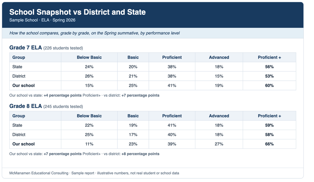
The snapshot puts the school beside the district and the state. In this sample, the percent of students Proficient or Advanced is 4 percentage points above the state in Grade 7 and 7 percentage points above in Grade 8.
The rest of the report suite
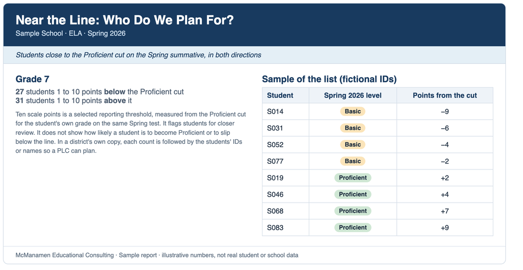
Cohort tracking answers "how did they move?" The other reports answer the questions that come next. The near-the-line list helps teams identify students whose results warrant a closer look. It shows the students within 10 scale points of the Proficient cut for their own grade, in both directions: 27 below it and 31 above it in this sample. Ten points is a threshold I selected for reporting. It flags students for review, and it does not show how likely a student is to become Proficient or to slip below the line. In a district's own copy, each count is followed by the students' IDs or names so a PLC can plan for specific kids.
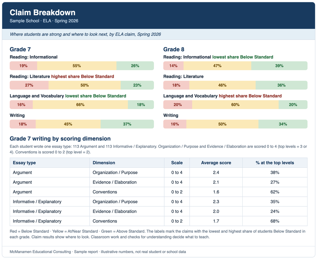
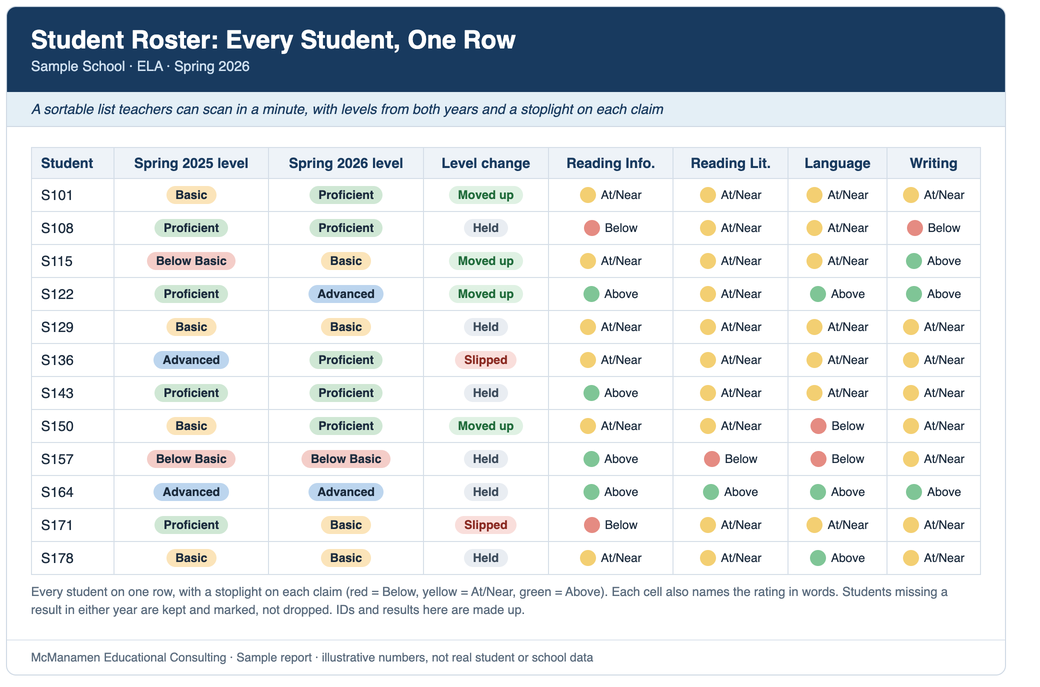
The claim breakdown shows strengths and gaps by ELA claim, with Grade 7 writing broken out by scoring dimension and essay type. It marks the claims with the lowest and highest share of students Below Standard. It tells a team where to look. Classroom work and checks for understanding then decide what to teach. The roster puts every student on one row, with both years' levels and a stoplight on each claim, so a teacher can scan a whole class in a minute. Students without a result in both years are kept and marked, not dropped.
Reading the reports with care
Moving between levels from one grade to the next shows a change relative to each grade's expectations. It doesn't measure how much a student learned, and it doesn't show that any particular instruction worked. A level change is a reason to look at the work, not a verdict. A student near a cut can move across it from a small amount of measurement error alone, so I'd talk about patterns across a group before I'd talk about any one child. The reports describe the students who were tested, and students who transferred in or out are listed separately. Science is tested only in grades 4, 8 and 10, so the same-student, adjacent-year design doesn't carry over to science directly. I'd build a different report for it. And I don't compare scale scores across grades.
What the district did with them
The reports were shared with the PLC teams. From them, the teams prepared a plan to work on specific targets for the 2026-27 school year.
That's the point of the reports. A good data report doesn't give answers. It helps a team ask better questions. Why did one grade move up more than the other? What was different about instruction, scheduling or interventions? Which students slipped more than one level? Those are the students to talk about by name in a PLC, not as a percentage. Along the way I learned to match students and not grade levels, to show the whole picture and not just an average, to make a report readable in five minutes, and to show my work so people can trust the numbers.
What I can do for your district
You provide the assessment exports your district already has, and the information needed to match students across years. You receive a workbook for each school, grade and subject, a plain-language list of what each report means, and a walkthrough with the teams who will use them. I tailor the schools, grades, subjects and planning questions to your needs, and scope and turnaround are agreed for each project. The data belongs to the district and the results belong to its schools.
How I handle student data. I work under the data-sharing terms your district requires, signed before any files change hands. Student files stay on my own computer. I use AI tools to help write and check the analysis code, and that code runs on my computer. I remove student names and IDs on my computer before any AI tool sees district data, and the final reports are built locally.
I don't publish a district's name, and none appears here. The examples on this page were built from made-up data in the layouts of the real reports, and no student names or IDs appear.
Wyoming is also moving to Pearson's statewide assessment system. The state has said that results from the 2026-27 summative and interim WY-TOPP assessments won't be available in Pearson's ADAM system until fall 2027, after new standards are set with the new items, measurement scale and reporting system. Comparing new results with earlier WY-TOPP results will therefore need care, even by performance level. The state has also said that districts must opt in to use NAVVY, the new classroom assessment tool that replaces the modular assessments. I can help your team in three ways: make the results you already have understandable, get your reporting ready for the new results, and look at what NAVVY exports actually contain before deciding which reports make sense.
McManamen Educational Consulting. Assessment, Data, School Improvement.